Using Python for Cell Clustering
Single-cell measurements can examine the heterogeneity of cell populations within a single condition or across treatments. A method to quantify and analyze these heterogeneous subpopulations is to group the cell measurements into discrete clusters, and then identify the cluster characteristics.
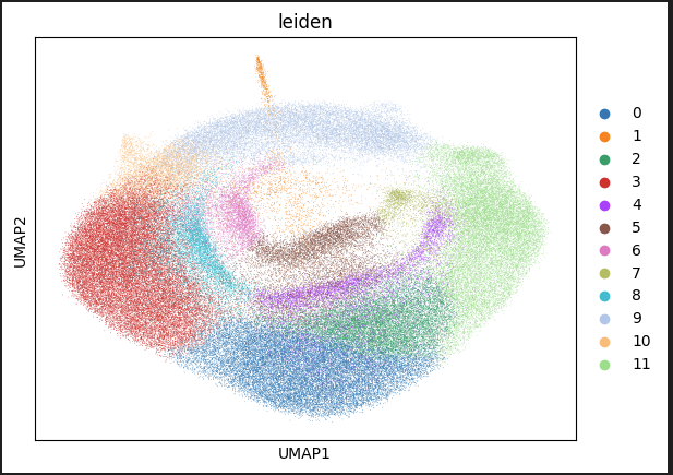
This tutorial provides steps on how to use Python-based tools with AVITI24™ cytoprofiling data to perform cell clustering using the Leiden algorithm. Upon tutorial completion, you will have a Uniform Manifold Approximation and Projection (UMAP) graph that visualizes the heterogeneous cell populations and their assigned clusters in two dimensions.
Before You Begin
Make sure that you have the following prerequisites:
The tutorial will guide you through the installation of the following python packages:
To install the cytoprofiling package, complete the following steps:
From a browser, access the Element cytoprofiling repository at GitHub.
Select the green Code button, and then select Download Zip from the dropdown menu.
Locate the downloaded zip file in your system.
Extract the zip file to your desired folder destination.
From the conda terminal, run the following command. Make sure that you replace
download-locationwith the file path of the downloaded zip file.pip install <download-location>/cytoprofiling-1.1.1/cytoprofiling-1.1.1/src/python
To install the leidenalg package, run the following command:
pip install leidenalg==0.10.2
To install the remaining required Python packages and enable all prerequisites, run the following commands in the CLI terminal with Anaconda:
conda create -n cytoprofiling-env python=3.10 pandas=1.5.3 numpy=1.23.5 scanpy=1.9.3 ipykernel=6.25.2 pyarrow=12.0.1 pip -c conda-forge
conda activate cytoprofiling-env
To use the conda environment with the Jupyter Notebook, run the following command:
python -m ipykernel install --user --name=cytoprofiling-env
Load and Configure the Data
In the CLI terminal with Anaconda, run the following command to open Jupyter Notebook:
jupyter notebookSelect New, and then select Notebook.
In the drop-down menu, select the cytoprofiling-env kernel.
To import the required packages, copy the following code into the first cell:
import pandas as pd
import json
import scanpy as sc
import numpy as np
import cytoprofiling
To read and normalize the data for a
RawCellStats.parquetfile, copy the following code. Make sure that you replacefile_pathwith yourRawCellStats.parquetfile path.raw_cell_stats_path = "RawCellStats.parquet"
panel_path = "Panel.json"
# read data
df = pd.read_parquet(raw_cell_stats_path)
# normalized per batch and filter
df = cytoprofiling.normalize_cytoprofiling(cytoprofiling.filter_cells(df))
with open(panel_path) as f:
panel_json = json.load(f)To use the cytoprofiling and scanpy packages to pre-process and cluster your data, copy the following code into the next cell:
# Convert dataframe to anndata
adata = cytoprofiling.cytoprofiling_to_anndata(df, panel_json)
# filter data columns to only include simple counts for protein and RNA
adata = adata[:,(~adata.var["is_unassigned"]) & (~adata.var["is_nuclear"]) & np.isin(adata.var["measurement_type"], ["RNA",])]
# convert column names to gene names and remove any resulting duplicates
adata.var_names = adata.var["gene"]
adata = adata[:, ~adata.var_names.duplicated()].copy()
# do processing of data to prepare for UMAP
sc.pp.log1p(adata)
sc.tl.pca(adata)
sc.pp.neighbors(adata)
sc.tl.leiden(adata, resolution=0.3, key_added="Cluster")
# calculate UMAP
sc.tl.umap(adata)
# plot UMAP with calculated cell phase
sc.pl.umap(adata, color="Cluster")
To run the code, Select the
Runicon.The following figure shows cells that are projected into UMAP space. The cells are colored by their cluster.

Interpreting the UMAP
The UMAP embedding projects all cell measurements from the RawCellStats.parquet file into two dimensions that visualize the cell heterogeneity. Different colors indicate each cluster of cells that the Leiden algorithm assigns, and represents similar cell subpopulations. Further analysis can quantitatively compare the characteristics that underly these clusters.
To generate different graphs and analyses, you can use other Scanpy plotting methods. For more information, see the Scanpy API documentation.